Dec 24, 2011
A decades worth of radio airplay, summarized in chart form from XKCD. What will this list look like in 2030-2039? Perhaps some tunes from The Barn's Holiday Mix?Happy holidays to all!
Oct 25, 2011
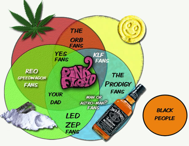
Leave it to our pals over at Cracked to not only put Pink Floyd in their satirical cross-hairs, but also embellish their skewering with a couple of charts that gently poke fun at the band's appeal, and its own idiosyncrasies.First up, is a Venn diagram that puts Floyd at the pharmacological center of several...
Oct 22, 2011
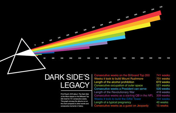
Pink Floyd week continues with another infographic...What does it mean to have staying power? Using the album covers iconic imagery, this infographic from the Behance Network, compares Dark Side Of The Moon's consecutive weeks on the Billboard Top 200 to other notable streaks and series. Zoomed image of the words...
Oct 20, 2011
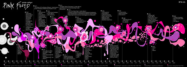
Here's a righteous Pink Floyd infographic, which chronicles significant milestones and band member movement during 40 years of band history. This was crated by a flickr user known as 802.11 and has made tons of appearances all over the web. A great use of some very Floyd-like psychedelic imagery to convey the information. I love it!Click...
Oct 6, 2011
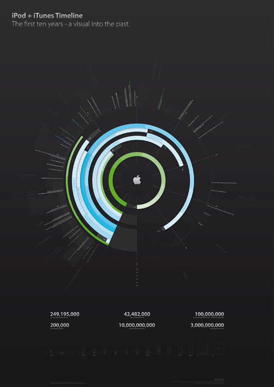
Theres nothing I can say about the vision and leadership of Steve Jobs that hasnt been said more eloquently in eulogies by people that were close to him.I can, however, offer some of the best visualizations on Apples way of revolutionizing the music industry.First, is a radial timeline the first ten years of...
Sep 23, 2011
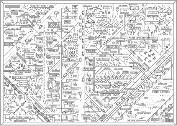
Today is Bruce's birthday. To celebrate, I'm pulling out to interested ways to visualize his work that were found on the web. From the beginning, Springsteen's songs told rich, and involved stories, and many feature places and names. The first addresses the places. Brooklyn based artist Dan Cassaro created a high quality poster that represents...
Aug 30, 2011
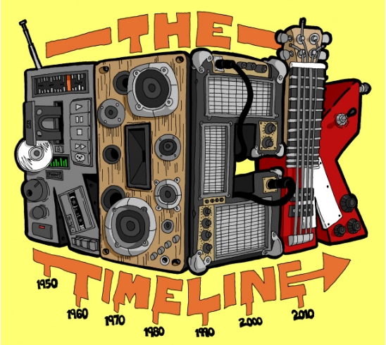
Back in the day, I was always more of a MAD guy than the cruder "knock-off" of Cracked. But, there's no denying that cracked.com owns the new media space, cranking out some decent listicles and some awesome viral content.This rock timeline, created under the Cracked banner by Winston Rowntree at Virus Comix, has...
Aug 23, 2011
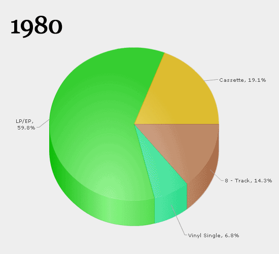
Quick... what was the first album you ever bought? If you've been a music fan for multiple decades, you probably remember it fondly or even with a slight tinge of embarrassment. Now... what format was it? A vinyl LP? A cassingle? 8-track tape? Think of the litany of devices you've had over the years to...
Aug 15, 2011
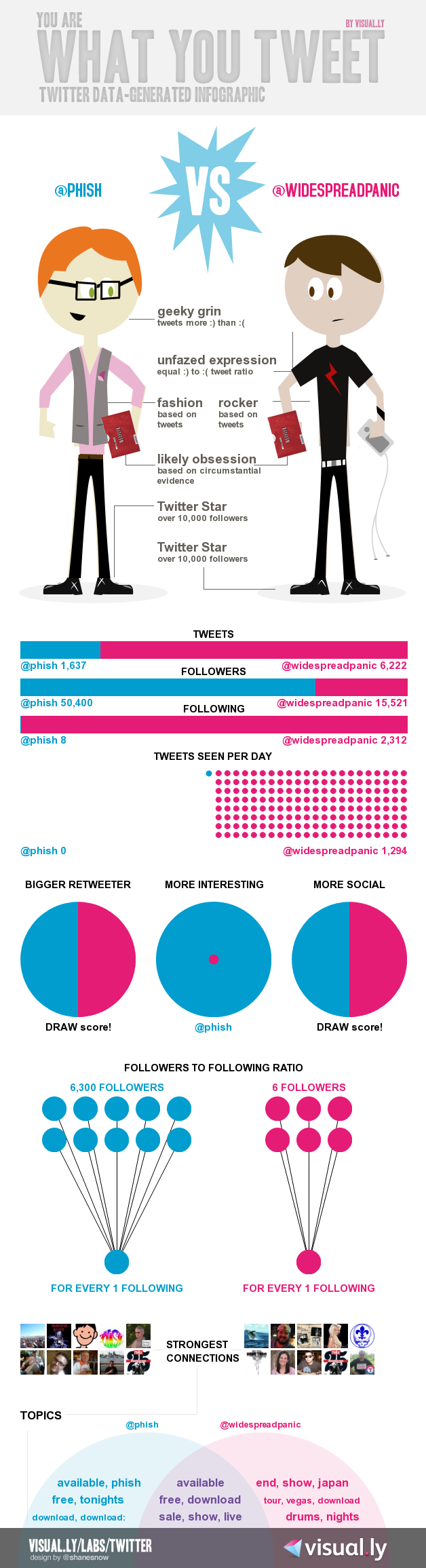
One of our more popular posts ever came in the wake of some rumored (but never materialized) Phish / Dave Matthews Band combo festival dates for the summer of 2011. We re-posted an infographic comparing fan reactions and perceptions about the respective bands and people just couldn't get enough.A perhaps just-as-polarizing comparison is the ongoing Phish...
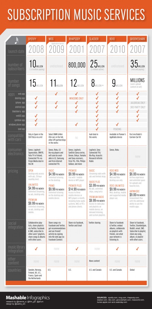
Aug 2, 2011
I've really been enjoying my first earnest foray into a music subscription service. For those not familiar what the exciting new entrant Spotify brings to the market... think Netflix' streaming service but for music. The catalog is huge and I've been pleased with access to otherwise hard-to-find music by indie and jam bands that I...