Apr 12, 2011
Came here looking for Summer Tour Info? Follow this link: http://tomorrowsverse.com/furthur You like the stats? Here are some key statistics about the songs played on Furthur's Spring 2011 tour (this breakdown includes the three night run in CO in February as well...for more information on data sources, please see the footnote at...
Apr 7, 2011
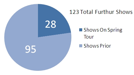
Came here looking for Summer Tour Info? Follow this link: http://tomorrowsverse.com/furthur Updated with data from the Boca Raton show.We're back! After taking the last couple of mini runs (NYE and Broomfield) off, we are here to deliver day-by-day rotation updates for Spring Tour.You may also notice some of the totals...
Mar 5, 2011
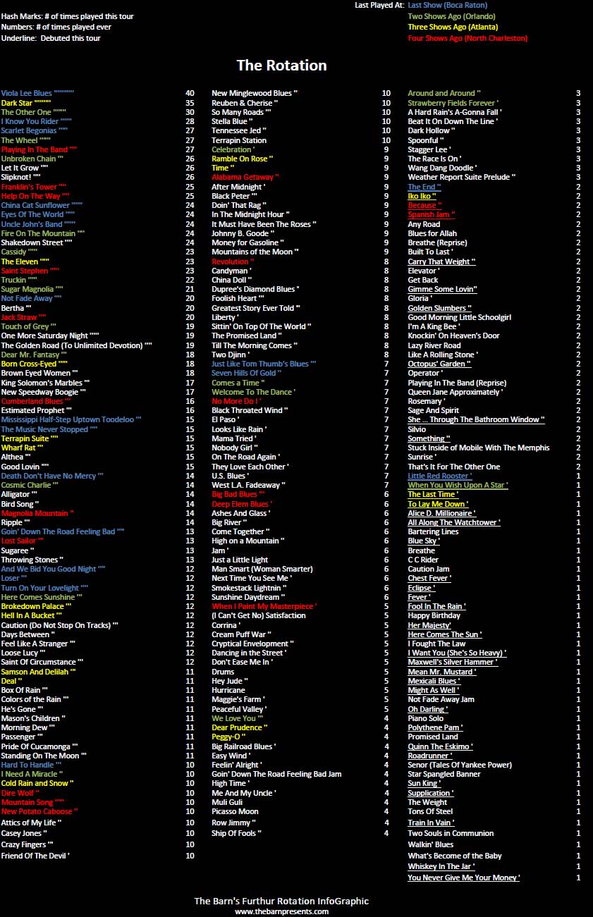
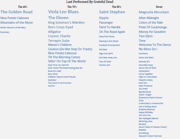
Updated 3/8 based on some discrepancies identified by the philzone.org communityThere's just something about Furthur. They've got so much Grateful Dead X-Factor yet still feel like their own band.I thought it'd be cool to start a series of InfoGraphics that compared the approaches of each of these bands that, using only setlist data and...
Feb 19, 2011
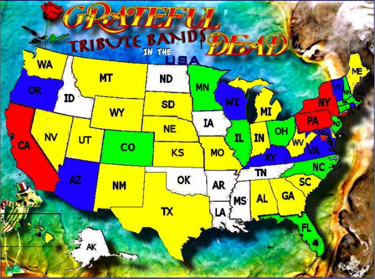
I recently stumbled upon a handy site, whose homepage falls right in line with The Barn's objectives of exploring the expanded world of The Grateful Dead and showcasing cool visual charts. The site is GratefulDeadTributeBands.com and their home page provides a nice US map color coded by the number of Dead bands they have...
Feb 12, 2011
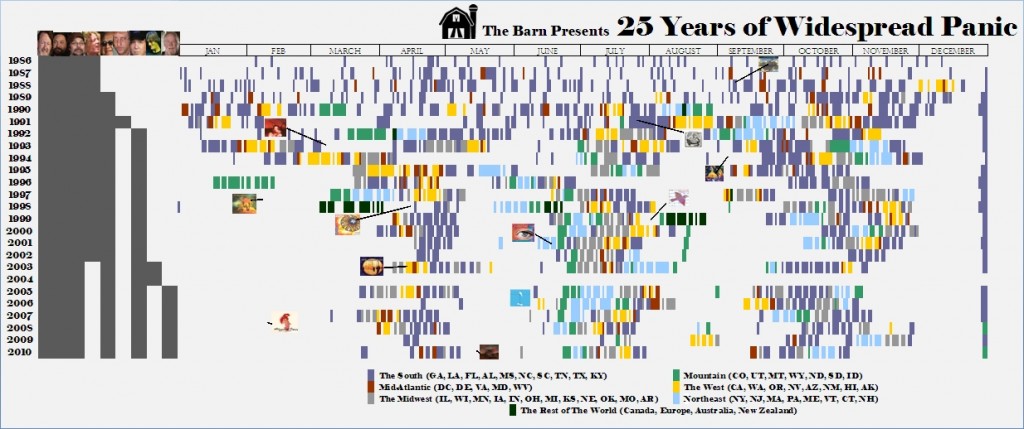
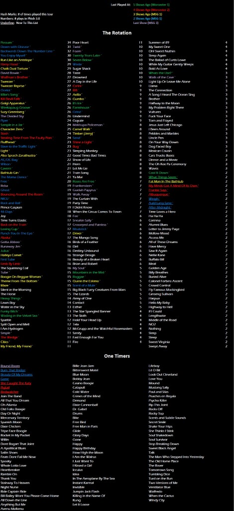
In celebration of the 25th anniversary of Widespread Panic, The Barn has created an InfoGraphic to attempt to put this incredible career and vast creative output into perspective.Working from a 25 year timeline from the band's first show in Athens, GA in February of 1986, this graphic plots the band members, shows, and studio albums (plus...
Jan 1, 2011
Now updated with MSG3 Data!A visual way of viewing Phish's last few shows within the context of their overall rotation and a cool way to guess what is coming next.Click to view full size.Here's how the rotation looked before the 1/1/11 show.
Oct 30, 2010
Continuing our new feature of music related InfoGraphics, we are celebrating the season with a look back at the Halloween shows of two of the bands with the richest tradition of Halloween fun: Phish and Widespread Panic.Step inside for a visual look into the Halloween history of these ambitious artists.The Barn's Phish Costume...
Oct 24, 2010
One of the new features we are rolling out with The Barn 2.0 is a focus on data visualizations and InfoGraphics that pertain to music. Thanks to blogs such as I Love Charts and Wired Magazine's InfoPorn, these are widing a wave of popularity lately amongst both nerds and geeks.Enter The Barn. With tons of...