One of the new features we are rolling out with The Barn 2.0 is a focus on data visualizations and InfoGraphics that pertain to music. Thanks to blogs such as I Love Charts and Wired Magazine's InfoPorn, these are widing a wave of popularity lately amongst both nerds and geeks.
Enter The Barn. With tons of songlists, show dates, lyrics and other data about our favorite bands at our disposal, we will compile it, process it and transform it into shapes, graphs, colors and text in ways that help fans bring out their own inner geek -- connecting with the music like never before.
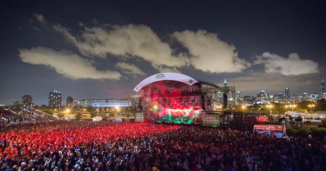
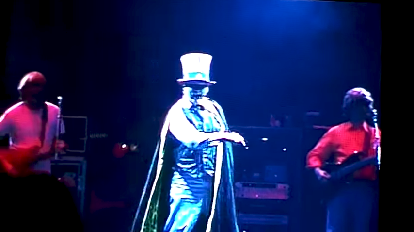
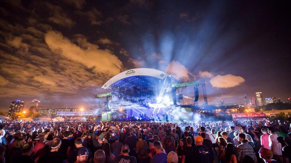
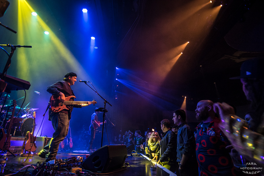
Our inaugural series of InfoGraphics provides a visual look into the song rotation of one of our all time favorites: Phish. With 100's of different songs performed since their reunion in March of 2009 and a commitment to shaking up songlists night after night, Phish is a band that keeps its fans guessing. Our graphic, updated after each show on this fall tour, is organized by the number of times each song has been played since the reunion, while highlighting the songs played at the last four shows using colors. Hash marks indicate the number times each song has been played on the fall tour. Fans will be able to see which songs have been played recently, and most often, giving a peek into the engine room, so to speak.
Keep your eye out for more original content in this vein and check the link after each show for an updated (we'll tweet and send email whenever its been updated).
We'll also try to showcase the best InfoGraphics we've found on the web. For starters, here's a video of a classic Beatles flow chart, which somehow manages to improve on the excellence of the print version. Enjoy!