Dec 21, 2010
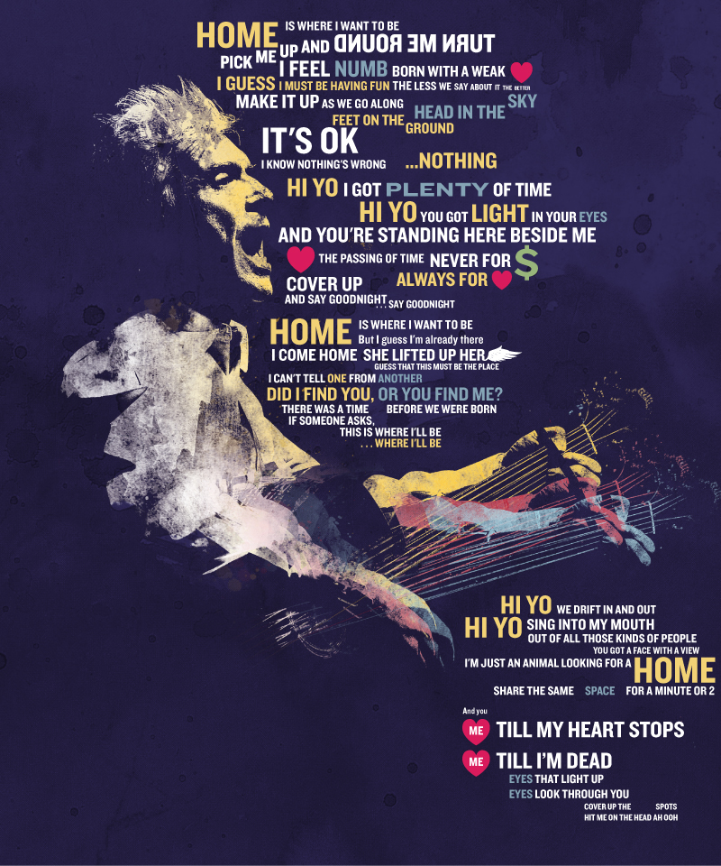
This offering is more of a beautiful, lyrical poster than a true InfoGraphic. But, the time is right to share, given our promise to focus on Talking Heads related content until the first of the year.Conceived and illustrated by artist TheCharles (and discovered via the seemingly boundless DeviantART website), I particularly love the color...
Dec 21, 2010
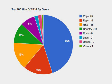
According to this graph from NPR's website, an analysis of the Top 100 Hits of 2010, Rock music accounts for 8% of the selections.Further, the article goes on to state that nearly 1 in 10 songs has a Dr. Luke credit, somebody who I'd NEVER EVEN HEARD OF before reading this article. Over twenty-five percent of this...
Dec 15, 2010
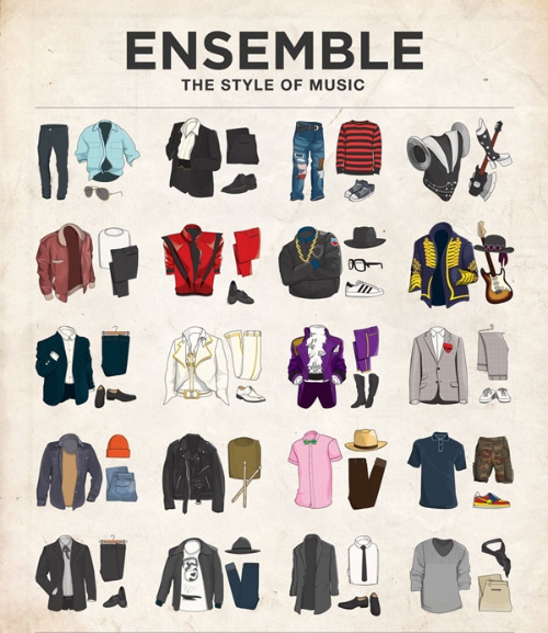
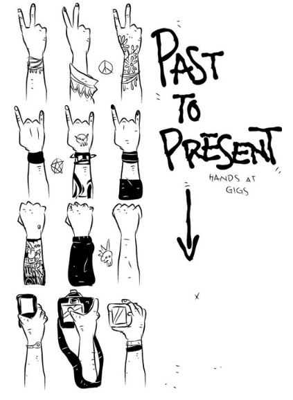
Here's a interesting chart with some of the most iconic outfits donned by well known musicians over the last 50 years. Click on the image to get to Moxy Creative's site (where it was developed) to see a slick interactive version with the answers and ability to look at close-ups of each ensemble -- a print...
Dec 11, 2010
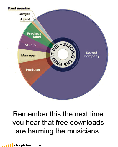
While we share a good amount of music around here, we generally stick to authorized recording or "liberated bootlegs" and we can't in good faith condone piracy. Of course, the traditional argument in favor of buying your music is to support the artist. However, the creator of this graphic, published initially at GraphJam, demonstrates that...
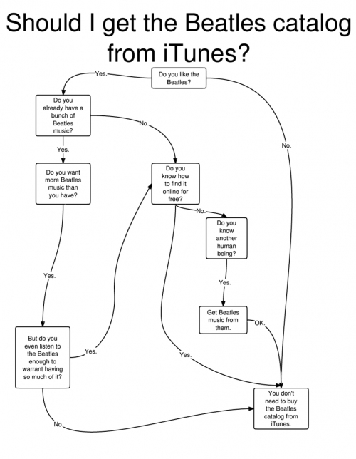
Nov 19, 2010
After much wringing of hands and rampant speculation, The Beatles back catalog was finally released this week on the Itunes Music Store. As momentous of an occasion as Apple is making this out to be, you may be wondering... after purchasing these tracks on vinyl, eight-track, cassette, CD, and mini-disc, in their original, reissued and...
Nov 17, 2010
InfoGraphics come in all shapes and sizes these days, from the data rich, statistics heavy like The Barn's Furthur Rotation InfoGraphic, to the example below, which is really more of a comic or than. Still, we cast a wide net for music related InfoGraphics, and so we're happy to share the following which we collected...
Nov 12, 2010
What would Fake Jerry do?I don't know, but if you were at the spring shows at the Auditorium, its likely you'll be heading down the to the UIC Pavillion tonight and / or tomorrow.Here's a little taste of what went down last time: The Barn has launched it's Furthur Rotation InfoGraphic series just in...
Nov 3, 2010
More music related charts and graphs from around the web. These two come courtesy of GraphJam.Glee recently broke the record for most appearances on the Billboard Hot 100 than any other non-solo act. Previous record holder? The Beatles.
Oct 30, 2010
Continuing our new feature of music related InfoGraphics, we are celebrating the season with a look back at the Halloween shows of two of the bands with the richest tradition of Halloween fun: Phish and Widespread Panic.Step inside for a visual look into the Halloween history of these ambitious artists.The Barn's Phish Costume...
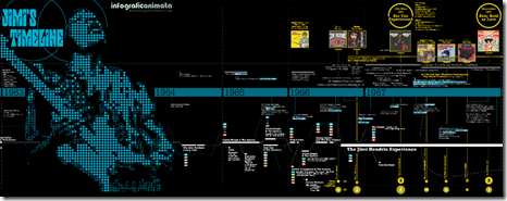
Oct 27, 2010
Marco Giannini created this Jimi Hendrix InfoGraphic featuring tons of data on his bandmates, recordings, concerts, life events and more. In its own way, it provokes same types of neural response that that Jimi's playing does -- virtuosic intensity coupled with beauty and elegance, and enough subtlety to keep going back for more.