Feb 22, 2017
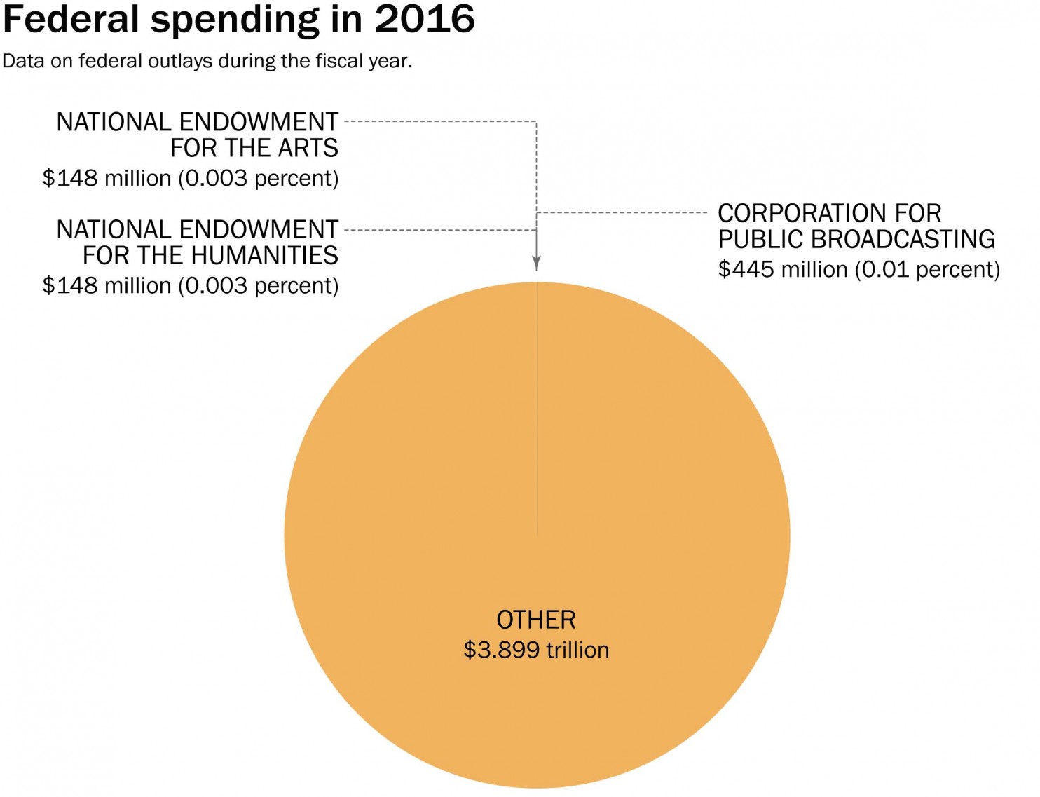
[fbilke]So much "real news" is getting mixed in with our music news these days. While federal funding for programs like the National Endowment of the Arts, National Endowment for the Humanities, and Corporation For Public Broadcasting may not directly affect the majority of music we report on at Tomorrow's Verse, they do help...
Jan 26, 2017
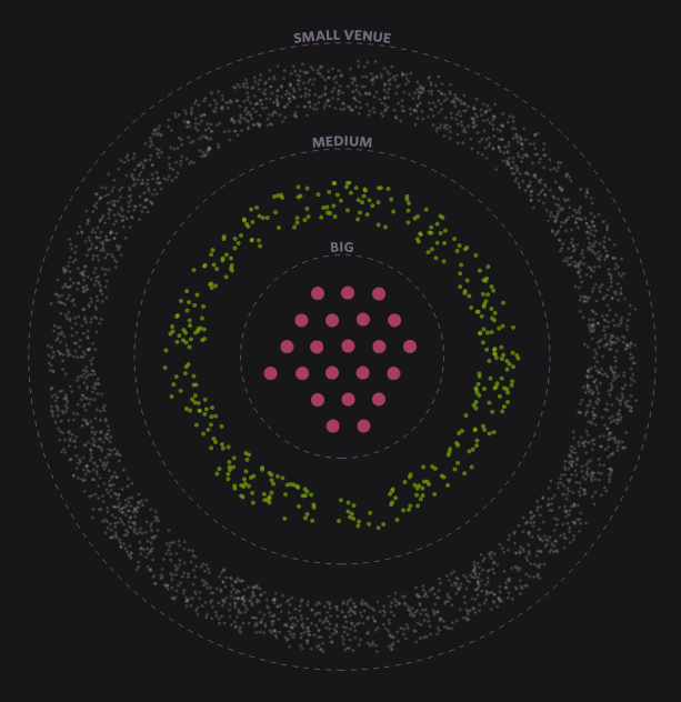
This is a fascinating subject that I've thought way too much about: how likely is it that a band moves from clubs to theaters and larger venues?For some bands, simply headlining any venue is the reward, but others strive to move on, climbing the ladder to bigger and bigger rooms in time.Russell...

Jan 23, 2017
Your favorite band may not be playing here anytime soon, but if this classical auditorium in Hamburg Germany -- part of a complex called Elbphilharmonie -- ever starts expanding its programming, maybe start looking into plane tickets?It is designed, by algorithm, to be an acoustically perfect room. The 10,000 unique acoustic panels give it...

Dec 30, 2016
As the Phish world prepares for the tenth Madison Square Garden Phish New Year's Eve show, our friends at the Mockingbird Foundation are busy celebrating the occasion.This infographic isn't as data intensive as, say, our Phish Rotation Chart or Tour Announcement Chart, but it does have some nice graphics, provides a cool reminder of...
Oct 5, 2016
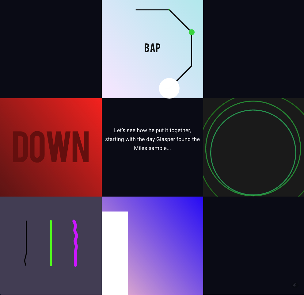
There are music related charts and visuals, and then there's this.The visual savants at Polygraph have gone beyond your typical data visualization and have created something interactive, educational, and altogether fascinating.In attempt to explain how a modern day genius, Robert Glasper, processes and samples the late great Miles Davis tune "The...
Aug 24, 2016
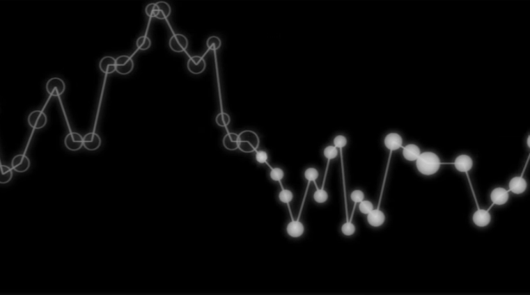
Apparently, this has been around since early last year, but it's the first time it's been on my radar.Here's a graphic score of James Jamerson's bassline on Stevie Wonder's "I Was Made To Love Her".It's quite beautiful for a number of reasons. It truly shows the genius of what Jamerson brought to...
May 12, 2016
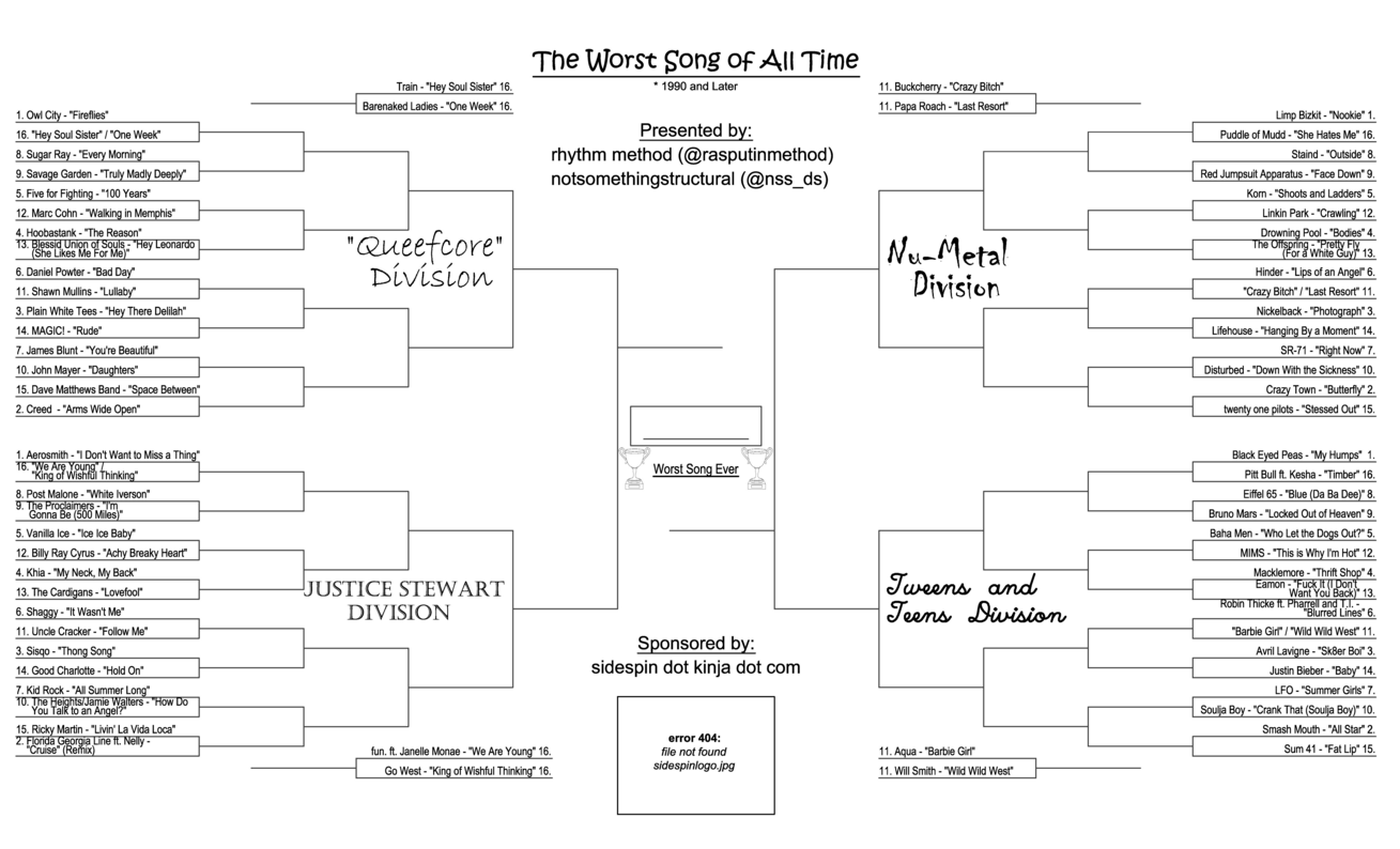
Are you fascinated with terrible songs? Would you like to participate in a long, drawn out process to determined the most terribleof those songs?You're in luck. Sidespin, a kinja blog that describes themselves as "a bad place full of jerks" have introduced a full bracket of 64 godawful songsreleased since 1990 in four delightfully named divisions:...
Apr 22, 2016
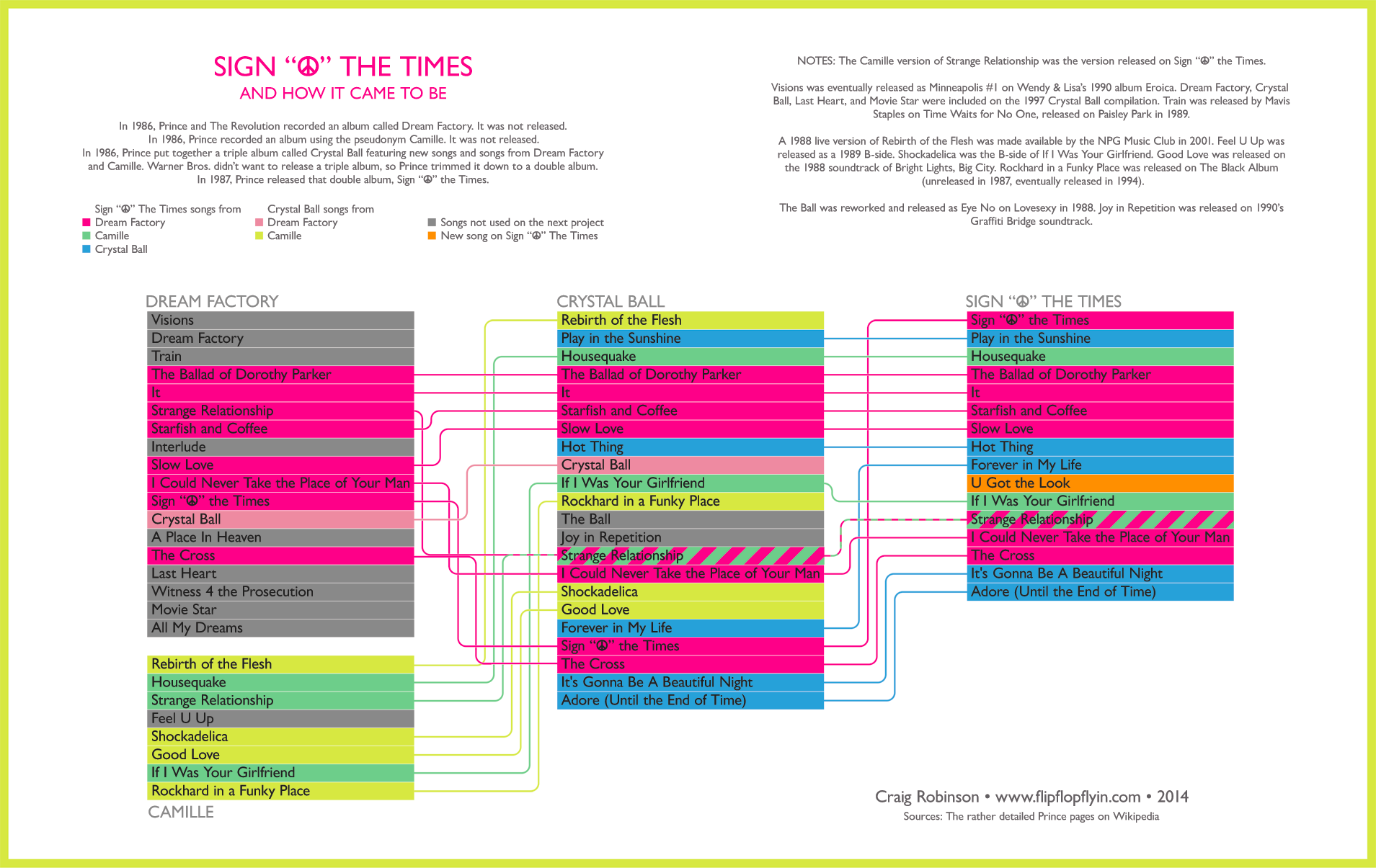
Designer Craig Robinson at Flip Flop Flyin' re-shared this 2014 infographic that tells the remarkable story of the SignThe Times album. Most of his data was sourced from Prince's vast wikipedia entries, and it is a lot.Definitely a cool visual representation of what goes on in the mind of an artist, who is at times...
Apr 8, 2016
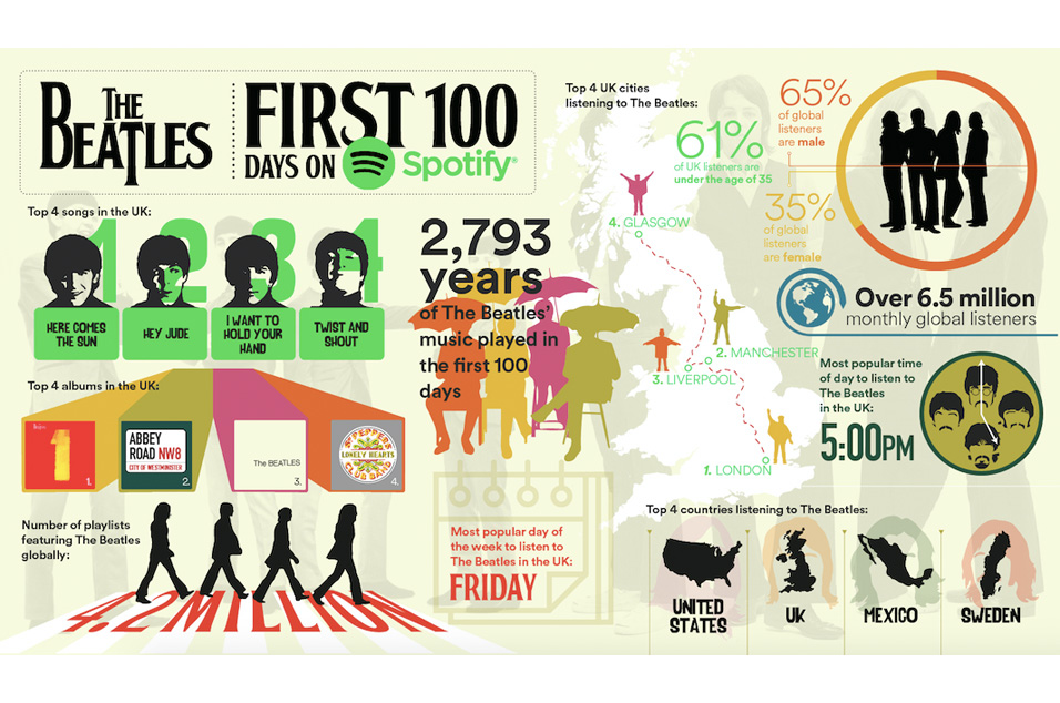
They held out a while, but it's been 100 days since The Beatles caved and allowed their music on Spotify.To celebrate, the service offered this UK-centric graphic summarizes their time on the service since Christmas Eve 2015.Word is the Beatles Anthology Series will come next to Spotify, so be on the look out for the...
Mar 30, 2016
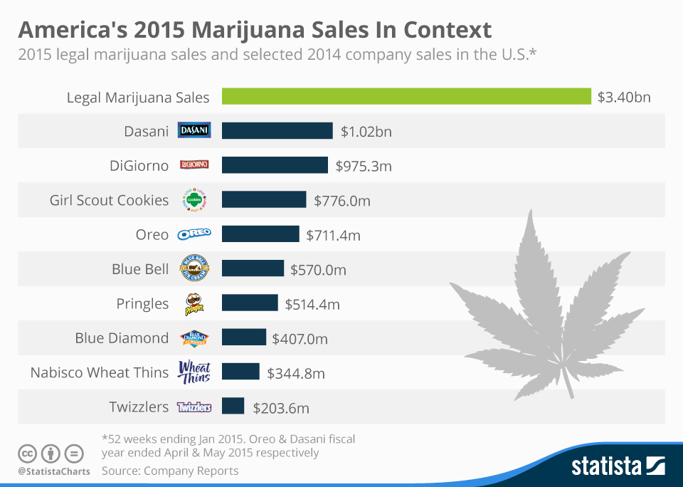
Okay, so this one is not music related, but thought that just maybe it would be of interest to our readers.The green revolution is big. How big? Let's say Oreos-times-five big.Check out this chart from Statista.Need I remind you that Twizzlers are legal in all 50 states, where marijuana has only been available...