The 40th anniversary of the landmark Grateful Dead 1972 spring tour of Europe was indeed something to celebrate. Of course, re-listening to my favorite shows was on the agenda to commemorate the occasion. But I also found myself reflecting, and diving into a series of written pieces: tweets reviewing each show on the tour from Jesse Jarnow (@bourgwick) and some lovely essays about select performances over the Steel Cut Oats crew at Hidden Track.
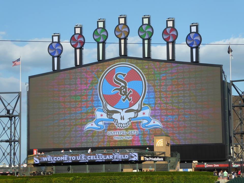
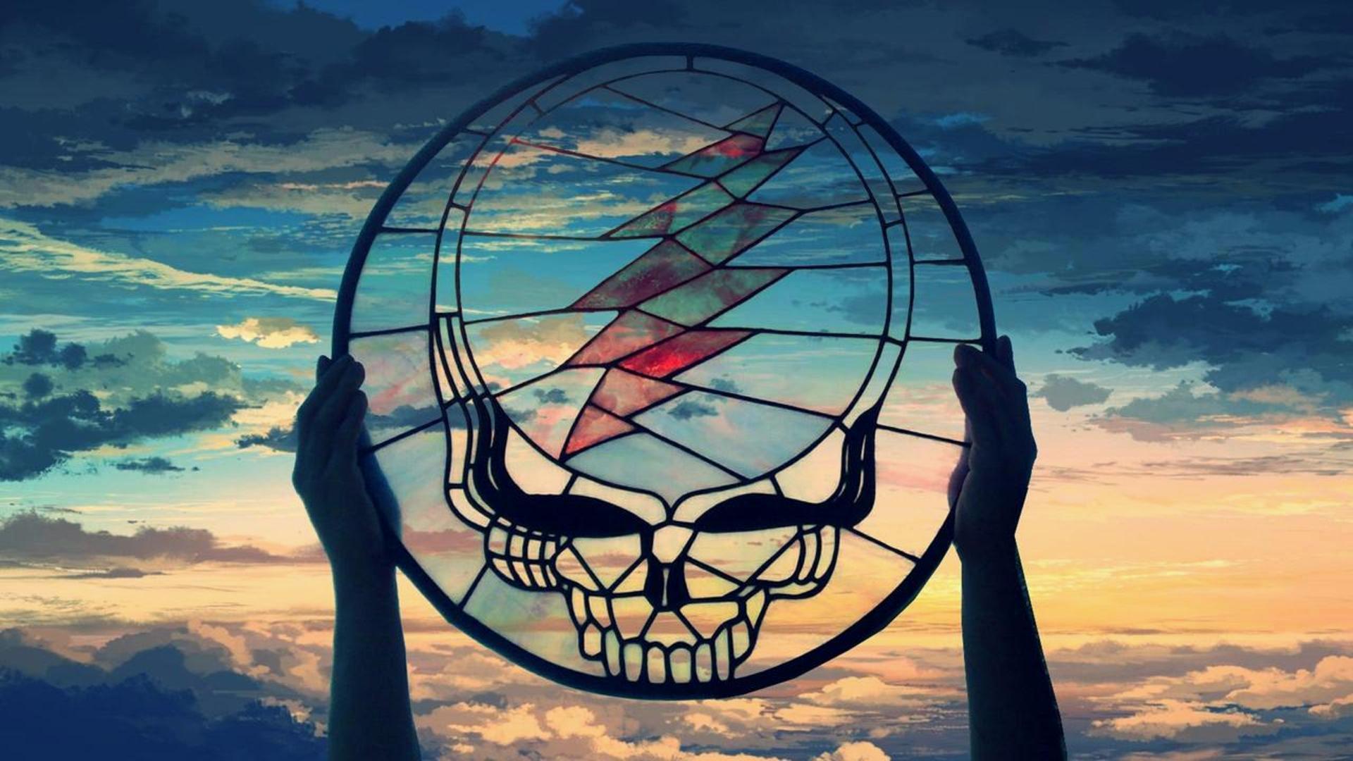
I began to notice that these pieces often featured the artwork from the Europe '72: Complete Recordings box set, a 73 CD set released last year, and it became clear that this product introduced a whole world of Grateful Dead imagery that is now being incorporated by the band in the marketing -- from their best-show-of-the-tour bracket to an online memory game. The imagery was actually quite stunning and oddly comforting -- consistent in theme and spirit with the iconic LP sleeve made by Stanley Mouse and Anton Kelley for the original live album, and exploring concepts in a way that were decidedly Grateful Dead.
I began to dig. Who was responsible for opening the door into the world of the Ice Cream Kid, the Bolos and Bozos once again? My queries led me to Scott McDougall, an artist who resides in the Pacific Northwest, who not only produced the images for the re-release, but also covers for the Road Trips series, the newer Dave's Picks releases and many other works that evoke the energy associated with psychedelic culture. What follows is a conversation we had about his influences, techniques and wild trip into the world of Grateful Dead, which began in Eureka, CA on 1/20/68 as a thirteen year old, standing just a few feet away from Bob and Jerry.
How and when were you first approached about doing work for the Grateful Dead? What was your initial reaction?
“When” is easy – Grateful Dead contacted me in 2005 to design a 40th anniversary, commemorative poster. “How” is a bit more complicated and is traced back to Rick Griffin. After his death in 1991, I had done a Griffin tribute cover illustration for The Rocket [a Seattle publication]. Art collector and Rick Griffin archivist, Denis Wheary, wanted to publish a small postcard set that was designed by artists who had an admiration for Rick’s work and the proceeds were to go to his widow, Ida, and children. I think Denis saw this cover and asked me to join in. Gary Houston at VooDoo Catbox in Portland screen printed the set that also included work by himself and others. Kevin Hutton was doing production work for Gary and has since migrated to the Bay Area to pursue web design. He put together an early site for me and since his girlfriend was an assistant to Peter McQuaid at Grateful Dead, my work caught his attention.
Needless to say, I was delighted to do a poster for them. But, a year later I was contacted again to design packaging for an ongoing series of archival recordings, which eventually became Road Trips. This was more down my alley as it had the potential to evolve and utilize more illustration.
 Did you have a specific approach to entering the world of the Ice Cream Kid for the Europe '72 box set? Any themes or icons you knew you had to address visually (or stay away from)?
Well, this was dicey territory for me in some ways. My basic art direction was to re-create the “feel” of the original Europe '72 LP covers, but not necessarily the imagery. My chore was to relate each cover to the locale of the show in some manner. It was also important that imagery could be relevant to the era. Obviously, they had to be done in traditional airbrush, floated on a white background and without type. The Ice Cream Kid was all Mouse and Kelley’s -- I’d always heard that it stemmed from an inside joke -- and I didn’t want to step on any toes there. While working on the concepts, I was adding my own references to GD lyrics, incidents I had read about that occurred during the tour, 1960’s concert posters, etc. Steve Vance, who did the production/design of the covers along with the book, often had some great suggestions and ideas for possible covers.
 Can you describe the challenge of creating album art in the style of other artists? Especially whose work is as iconic as Mouse / Kelley?
It’s rare that I’m asked to replicate someone else’s style, but I had grown up with their work and knew it well. I think it was late in 1967 in Eureka, CA that I saw the Family Dog’s painted panel truck parked next door to my house. One of the early founders, Luria Castell, was interested in some out of the way real estate in Humboldt County that my neighbor was brokering. I was introduced to Luria and she informed me that Stanley Mouse had painted the sides, Moscoso had painted the hood and fenders and Rick Griffin had painted the roof (which was a giant poppy flower). The artists were all familiar to me from my poster-collecting obsession. I was fascinated by this paint job and it also introduced me to the airbrush.
About a year or so later, I had an airbrush and compressor and I’ve been using one ever since.
Technically, this was a pretty, straight forward job. My biggest challenge was the timing. The project wasn’t finalized until the set was offered on dead.net and sold out. I started in mid-January and the 22 covers weren’t due until June. This gave me approximately 5 ½ days for each cover, which I knew I could comfortably accomplish. Some scheduling changes made it necessary to bump up the due date to April 1st which then gave me about 72 days to complete everything - which was just over 3 days allowed for each piece (including sketches and time for concepts and research). I’m used to this pace for a week or two – but it was a long haul without any time off. I finished the paintings and photographed them with a day to spare.
 Which artists (or other influences) do you think have most directly affected your personal style?
I’m self-taught. For me this has been a continuing education of being able to study the art I admire the most and ignore what is irrelevant to me. I could easily name a 100 or so artists and musicians that have amazed me and contributed to what I do. My older brother, David McDougall, is a painter and I have to give him the initial credit for turning me on to surfing when I was 11, and to Rick Griffin’s work a couple of years before the poster scene exploded in San Francisco. Without a doubt, Rick Griffin, Stanley Mouse, Alton Kelley, Wes Wilson and Victor Moscoso would head up any list I could come up with along with a number of others from that scene such as Bob Fried and George Hunter.
The underground comix scene added R. Crumb and Robert Williams to the list. Illustrators from the early days such as N.C. Wyeth, Howard Pyle, Maxfield Parrish, Alphonse Mucha and J.C. Leyendecker are always humbling. The southern California airbrush artists in the 70’s like Charles White, Dave Willardson and Peter Palombi really cemented my interest in that tool. I could keep going on to the present time. Most on this list are all commercial artists or illustrators to some degree, which I’ve always been able to identify with.
Is there a difference in how you approach GD commissioned work versus other poster-art or rock designs? How much freedom are you given to pursue your own ideas vs. specific direction?
Like most professions, the client’s wishes need to be at the top of the list if you want to keep working. Usually, I’m asked to design and illustrate a project in a “60’s” or “Fillmore” style, which is actually quite broad if you really look what was produced during the years 1966-1969. Its original purpose was to advertise music events to counterculture type pedestrians. Outside of the music business and a few editorial instances, the style rarely works and just looks lame. Of course, there is also the legibility factor in psychedelic lettering that is always an issue. After a while, you begin to see the issues before they are pointed out and find yourself editing even your sketches.
However, the Grateful Dead evolved out of the 60s and have always had some visual roots there along with freedom for creativity. Luckily, this has persevered and I’m usually given the chance to present my ideas on any given piece. Throughout the Road Trips series and now, Dave’s Picks, I’m given the date and the venue to go on and that’s about it. When a release has a title to work with it’s much easier to tie the art to the music. Occasionally, I’m given someone’s concept for a certain cover that they’d like to see – but usually I’m on my own.

The concepts don’t always fly or I may have more than one direction to explore and am usually given the time to do so. While developing the Road Trips series I was initially given about eight weeks to come up with design solutions for a template that we could re-use for the duration of the series, that could have an appropriate illustration plugged in and a changing color palette. Since all of my preliminary work is in pencil, it was a real treat to spend this much time at such an early stage.
What does the future hold... both for the GD-related work and otherwise?
I wish I knew. I’m usually at the bottom of the list to find out what’s coming down the road as far as Grateful Dead goes. I had a few weeks to contemplate the Europe '72 box before I got the green light, but usually I’m about the last to find anything out. I will probably get the Dave’s Picks Volume 3 assignment, too. I’m currently working on a Seattle Hempfest logo and a T-shirt design for a deceased rock n’ roll star.
Anything else you'd like to share?
How about my website? www.scottmcdougall.net
Want more Europe '72 in your life? Enter The Barn's contest to win a copy of the Remastered CD and The Volume 2 Companion Set and stream some selections below.