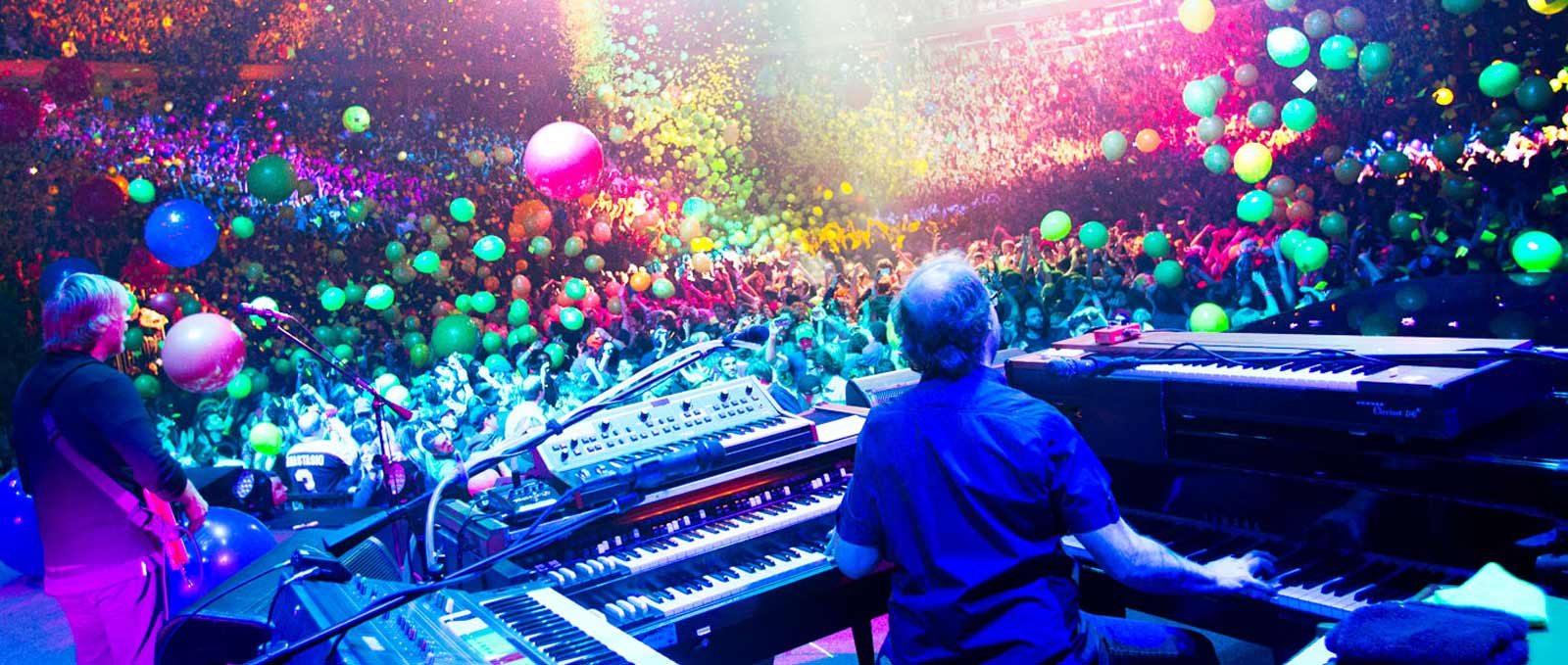
Sep 2, 2016
This morning, the always provocative @yemblog #yembconvo posed a simple, but interesting question.YEMblog Conversation: Rank the following in importance to you to attend: #phish festival, Dicks, Halloween run, New Years run #yembconvo YEMblog (@YEMblog) September 2, 2016While looking at the invdividual answers is enlightening, the aggregate is truly fascinating.Using a simple methodology --&...

Aug 24, 2016
Apparently, this has been around since early last year, but it's the first time it's been on my radar.Here's a graphic score of James Jamerson's bassline on Stevie Wonder's "I Was Made To Love Her".It's quite beautiful for a number of reasons. It truly shows the genius of what Jamerson brought to...
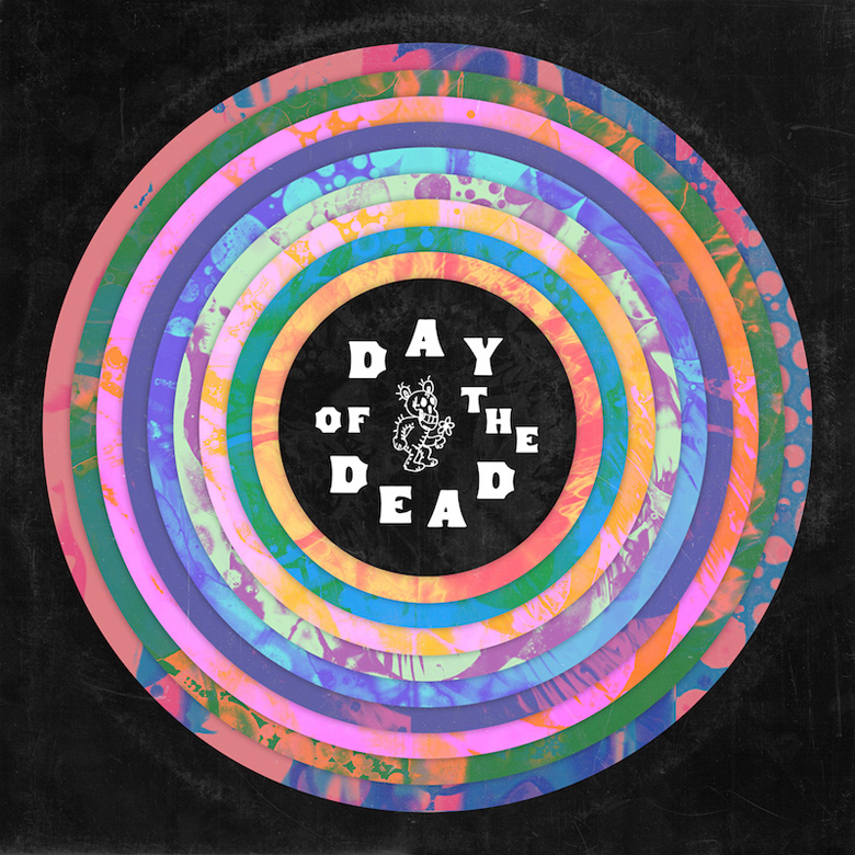
Jul 26, 2016
Spotify has released a documentary on Day Of The Dead, the massive, all-star Grateful Dead compilation spearheaded by the National and released in May.Recording more than six hours of material over six years, the project benefitted the Red Hot Organization, and was certainly one of the most ambitious compilations in recent times.Following the...
May 12, 2016
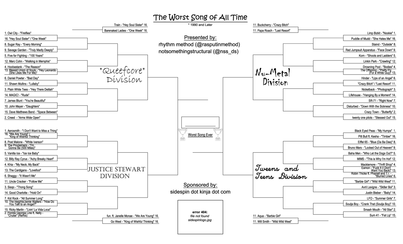
Are you fascinated with terrible songs? Would you like to participate in a long, drawn out process to determined the most terribleof those songs?You're in luck. Sidespin, a kinja blog that describes themselves as "a bad place full of jerks" have introduced a full bracket of 64 godawful songsreleased since 1990 in four delightfully named divisions:...
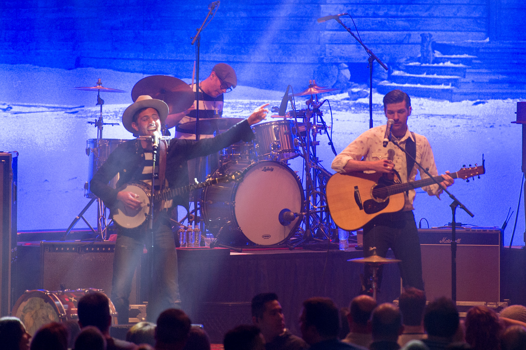
Apr 25, 2016
While we posted up our full show review of Friday's show, and a recap spotlighting the surprise Prince cover for Thursday's, Saturday's show closer ended up revealing quite a bit more about the The Avett Brothers than I had previously thought.Not unlike many of the other bands we follow around here, it appears they...
Apr 22, 2016
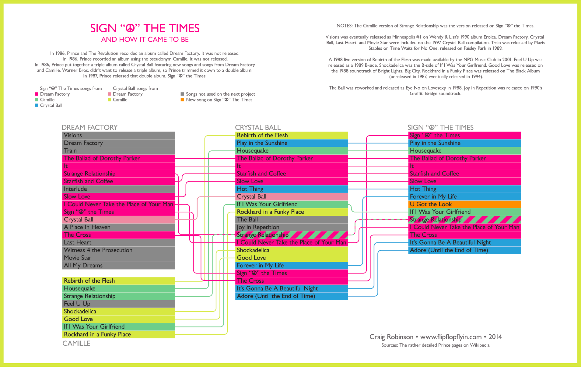
Designer Craig Robinson at Flip Flop Flyin' re-shared this 2014 infographic that tells the remarkable story of the SignThe Times album. Most of his data was sourced from Prince's vast wikipedia entries, and it is a lot.Definitely a cool visual representation of what goes on in the mind of an artist, who is at times...
Apr 8, 2016
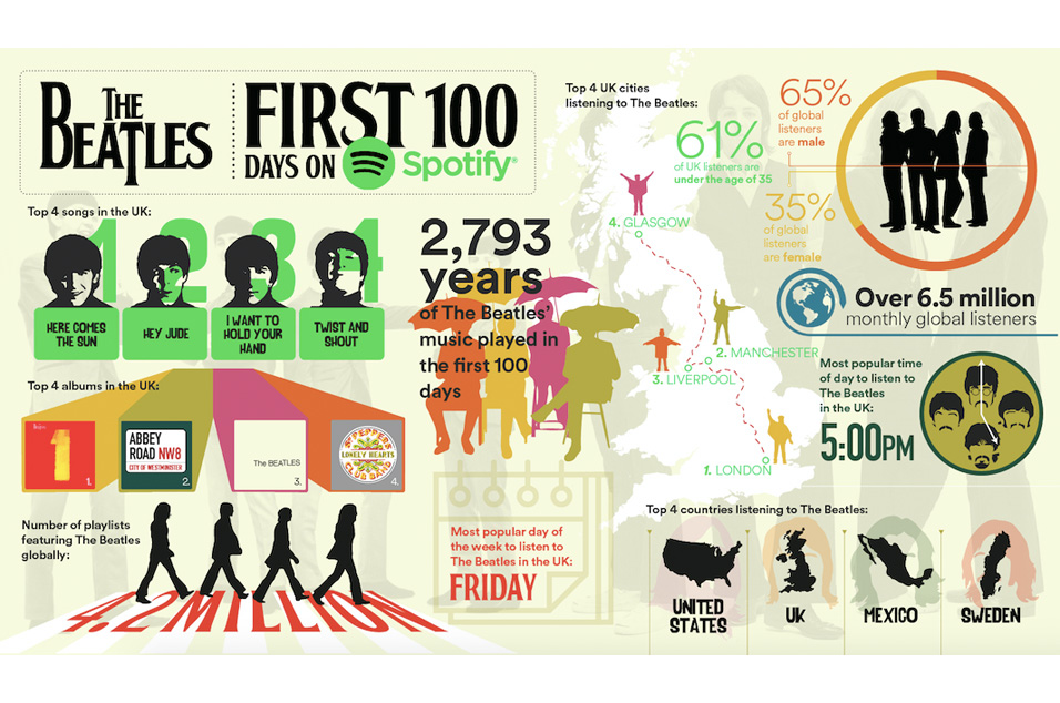
They held out a while, but it's been 100 days since The Beatles caved and allowed their music on Spotify.To celebrate, the service offered this UK-centric graphic summarizes their time on the service since Christmas Eve 2015.Word is the Beatles Anthology Series will come next to Spotify, so be on the look out for the...
Mar 30, 2016
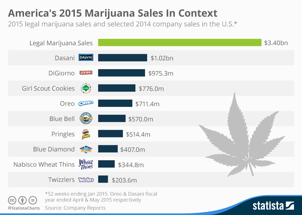
Okay, so this one is not music related, but thought that just maybe it would be of interest to our readers.The green revolution is big. How big? Let's say Oreos-times-five big.Check out this chart from Statista.Need I remind you that Twizzlers are legal in all 50 states, where marijuana has only been available...
Mar 18, 2016
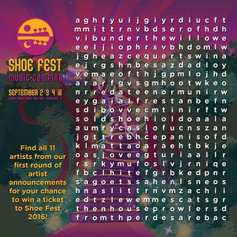
Those pranksters at Shoe Fest have done it again. Sure, some festivals can just announce their lineup. Shoe Fest hid the first 11 artists revealed for their Labor Day Festival in Manteno, IL via a Word Search puzzle. What's more, the offered a free ticket to the first person to identify and tag all eleven...
Mar 15, 2016
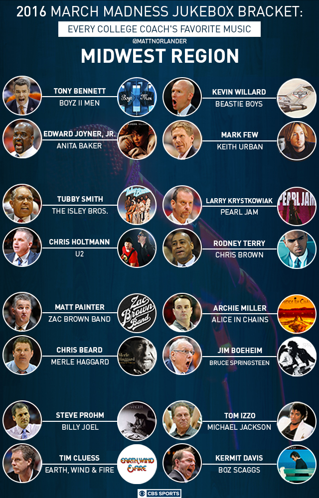
Here's an interesting way to fill out your March Madness bracket.CBS Sports' Matt Norlander interviewed every coach in the field of 68 teams in the NCAA Men's Basketball tournament about their favorite band.The results teeter on the edge of enlightening and bizarre. A lot of Bruce Springsteen (or course), some Pearl Jam and one...