Apr 15, 2014
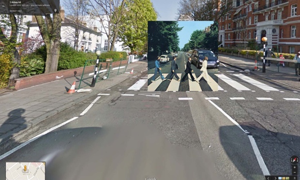
I've looked at some of my favorite album cover art so many times, I tend to think of it as divorced from greater context, that the images aren't actual photos of real places.But indeed they are! In fact, many of them have been cataloged by Google's cameras using it's Street View feature. So, of...
Mar 21, 2014
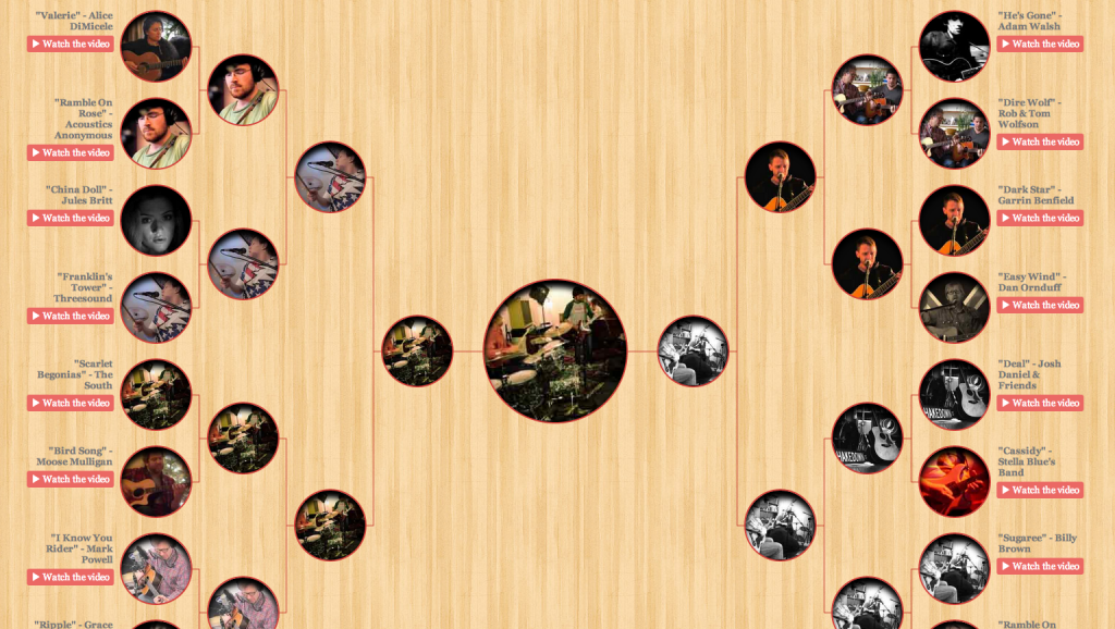
Based on activity in the jamband blogosphere, I'm guessing we may have crossed threshold of peak jam bracketology. In 2013, bloggers (and official band sites) flooded the Internets with their own fields of 64 to prove what the best show, song, jam or run from the band of their choice would be, but this year things seem...
Mar 19, 2014
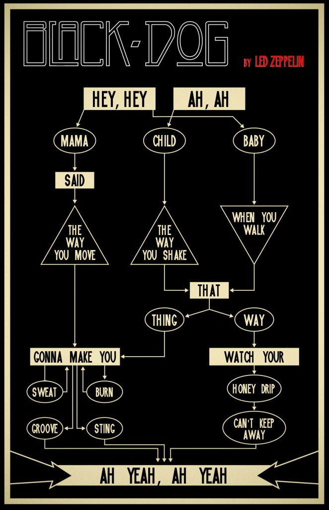
Modularity is cool. Flow charts are neat. But Led Zeppelin RULES.Here's all three mashed up into one, courtesy of Red Bull (?!).
Mar 6, 2014
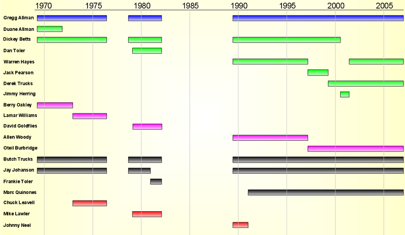
As we stare down what could be the final Beacon Theater Run in the forty-five year career, I was hoping to find a visual that could put it all in perspective.If you know where to look, wikipedia's got some great resources, and this chart provided me exactly what I was looking for.That's twenty...
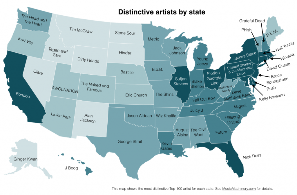
Feb 26, 2014
There's some pretty interesting math that went into creating this map, so definitely check it out in its original context at musicmachinery.com. Using days analysis, the author is trying to identify an artist that is popular in one state, that doesn't get as much love elsewhere. A few states that I had...
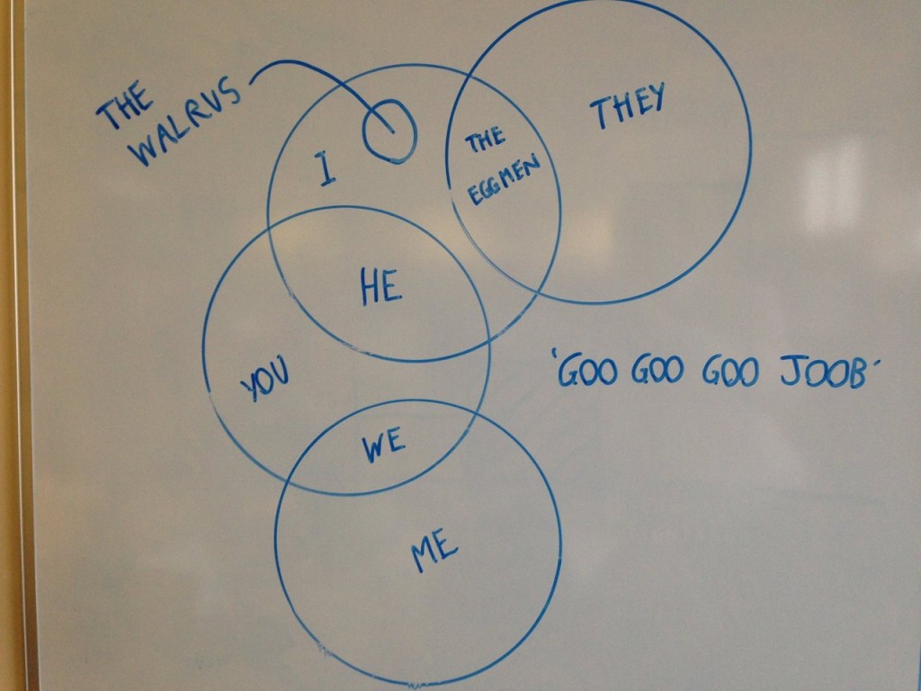
Feb 11, 2014
I'd like to buy a drink for the author of this one but, regrettably, it was presented unattributed at I Love Charts tumblr.Pretty simple concept: just take the byzantine lyrics of The Beatle's "I Am The Walrus" and visualize them. A Venn works surprisingly well.Also those circles are very well proportioned for a...
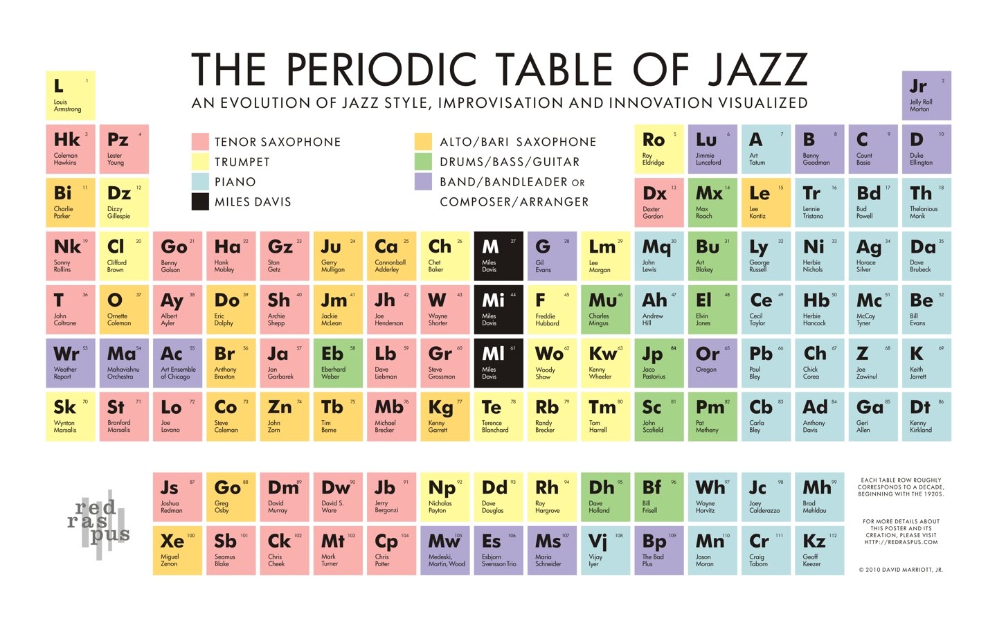
Jan 15, 2014
A sure fire way to get your infographic some attention is to find a way to squeeze your info into a Periodic Table. It''s even better if you can use the format to imbue a little meaning on into your data (check out this Periodic Table of Phish).That's just what the designers at Red...
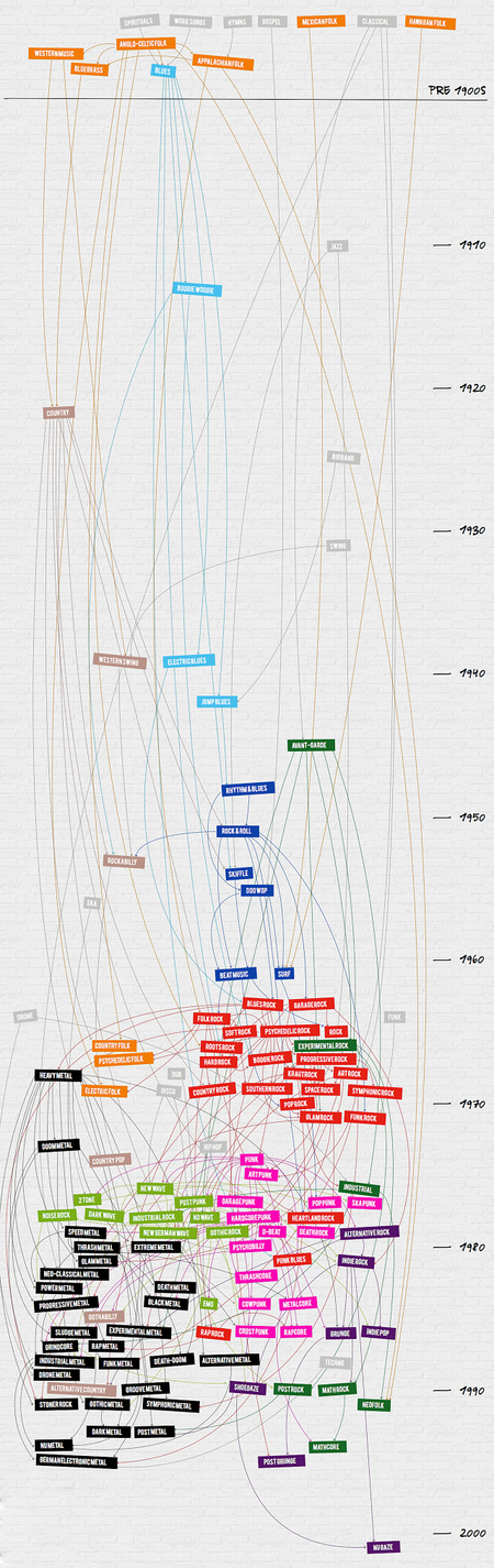
Jan 10, 2014
The creator of this Infographic contacted me with the question: did we get it right?Well, not sure if anybody could adequately fact check this winding visual amalgam of genres related to Rock and Roll over a 100 year timeline, but it is sure fun to click around in. Click through and the first thing you'll...
Jan 10, 2014
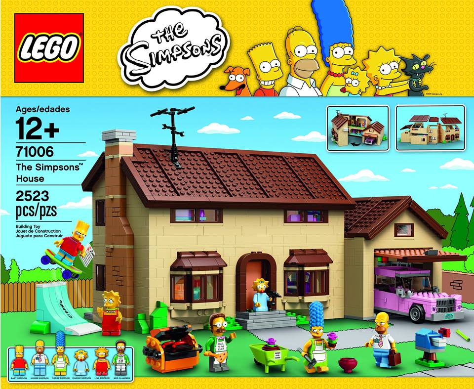
There have been times of the past year that I need to keep reminding myself that this is a MUSIC blog and not a LEGO Blog. But sometimes we just have to go there. This is one of those times, as The Barn has not been shy about Simpsons coverage as well (after all, we...
Dec 12, 2013
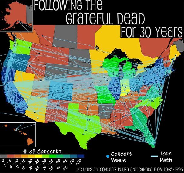
Was hoping to share this closer to Phish's actual 30th anniversary last week, but best laid plans.Anyway, these are a set of maps created by Seth Kadish and Jonn Rosen that circulated earlier this year but are a bit hard to track down. They essentially comparing Grateful Dead and Phish gigs over their similar 30...