
Jan 31, 2013
To celebrate 55 years of Lego, the company created fifty-five posters depicting popular culture vis a vis the reliable, interlocking toy brick. The complete list includes movies, stories and other elements, but I wanted to single out the nineteen music related ones here. They cover the gamut from bands to albums to songs, mostly playing on...
Jan 29, 2013
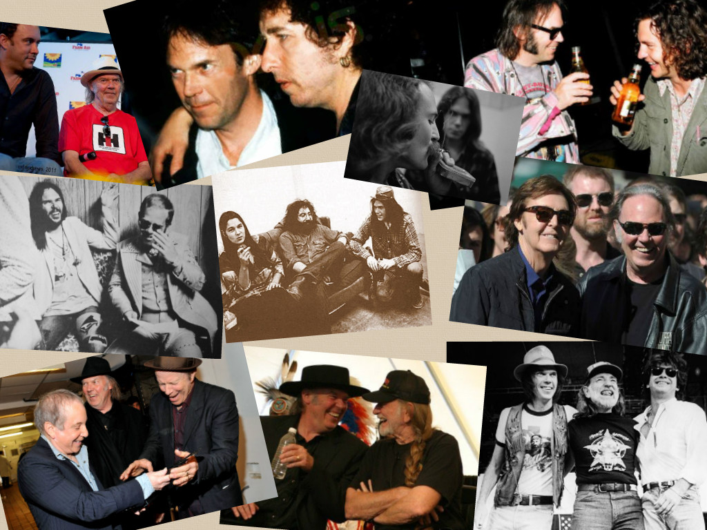
I recently finished Neil Young's autobiography Waging Heavy Peace -- and while I'll save all my thoughts on that tome for another post, one of the things that did stand out was how much he values the friendships in his life, whether they be musical, business or otherwise. At around the same time, I came...
Jan 16, 2013
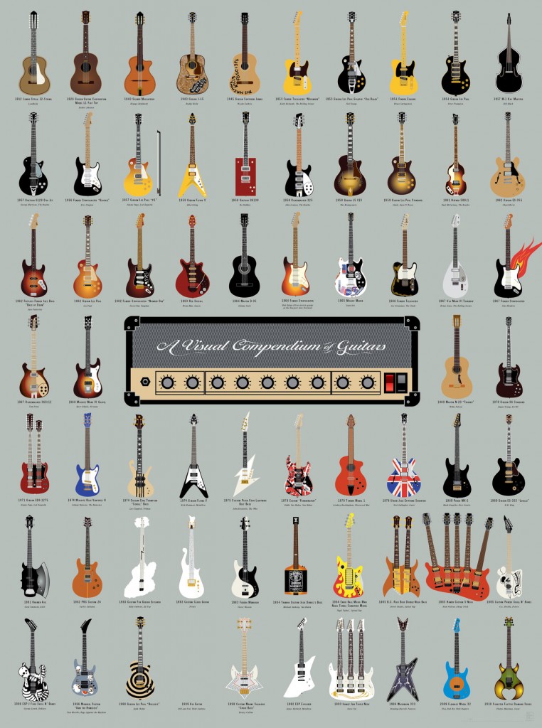
Pop Chart Lab makes some of the coolest looking charts / prints / posters that I've seen. Their design philosophy employs a simple, clean aesthetic. I'm particularly happy to see their music-related efforts pop up every now and then. Though this print doesn't feature an Irwin or Languedoc, there are pleny of iconic guitars (...
Jan 4, 2013
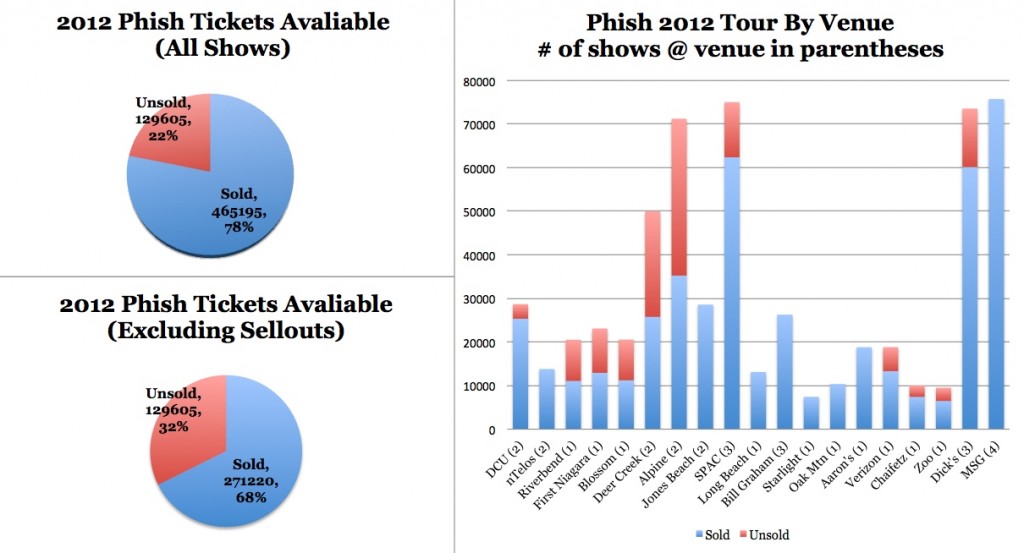
Hidden Track did some outstanding research into the total sales of the Phish concerts in 2012. Upon seeing the figures, they seemed to demand a visual presentation. I tweeted the following image, and am putting up on the blog for increased visibility.We've definitely seen a trend towards smaller venues in 3.0. With some of the larger...
Nov 29, 2012
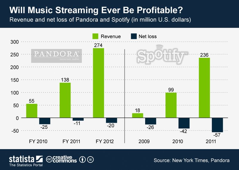
One of the most fascinating things to observe as a huge music fan and somewhat "technology forward" individual is the shifting landscape of music consumption. The vast physical musical collections that used to line my shelves were eventually digitized and stored locally, until finally much of the music I consume comes from the cloud.This...
Nov 13, 2012
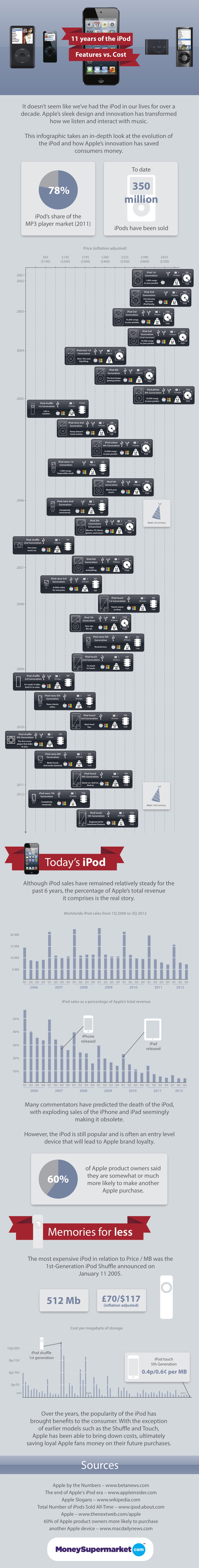
I usually not a big fan of these types of "giant" infographics, usually created by shady Internet companies to generate link bait, but this one is actually informative and pretty well laid out. It brings me back to my very first iPod (3rd generation, 10GB... which I pronounced the greatest invention in the history of...
Nov 1, 2012
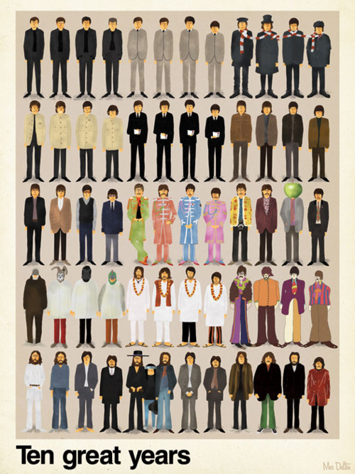
Ten years, 49 figures, 12 iconic looks, 6 people. This poster, found at Audry Wiener Dog Tumblr, oozes worlds of musical output while focusing only on their visual style. Love the clever touches like Pete Best in the first pose and Yoko squeezed into the penultimate one.
Oct 24, 2012
Webcomic The Oatmeal is extremely popular. So much so that Matthew Inman, its creator, was able to motivate tens of thousands of donations to charity (including the building of a goddamn Tesla museumte...not the Tesla you're thinking of music fans) entirely via mentioning it on his blog. So, while the site probably doesn't need...

Oct 19, 2012
While searching for an online Venn Diagram creator for my Springsteen at Wrigley Recap, I came across an interesting site that generates Venns automatically based on the most common Google Suggest autocompletes for any given question. You just provide it with a query and three common search terms, and it finds the most likely searches...
Oct 17, 2012
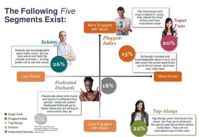
If you ever thought for a second that the relentless consumer profiling practiced by our corporate overlords didn't apply to concert goers or music fans, think again. In their study Anantomy of a Live Music Fan: The Social Effect, BandsInTown offers a consumer segmentation analyis that is as robust as any you'd find in just...