May 19, 2011
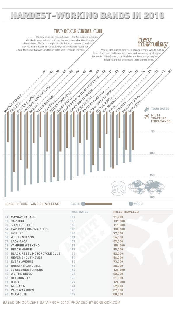
Practice make perfect, this much we know. I have always been a huge advocate of bands that spend quality rehearsal time and many many shows working out their live act on the road.This infographic from Songkick made the rounds of InfoGraphic freaks earlier this year under the banner of "Hardest Working Bands of 2010".There...
Apr 28, 2011
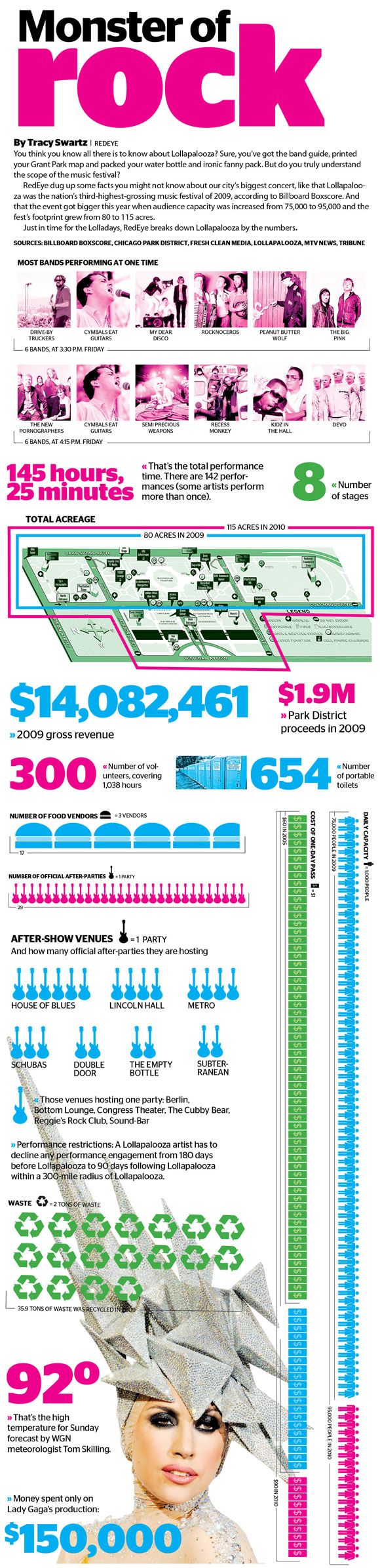
After this week's artist announcement, it looks like this will be another year that we won't be attending the biggest music festival that Chicago has to offer. Other pundits have already said it better than I can, but the prevailing thought seems to be that bigger and more diverse does not equal better. Certainly, the...
Apr 12, 2011
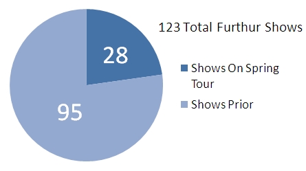
Came here looking for Summer Tour Info? Follow this link: http://tomorrowsverse.com/furthur You like the stats? Here are some key statistics about the songs played on Furthur's Spring 2011 tour (this breakdown includes the three night run in CO in February as well...for more information on data sources, please see the footnote at...
Apr 7, 2011
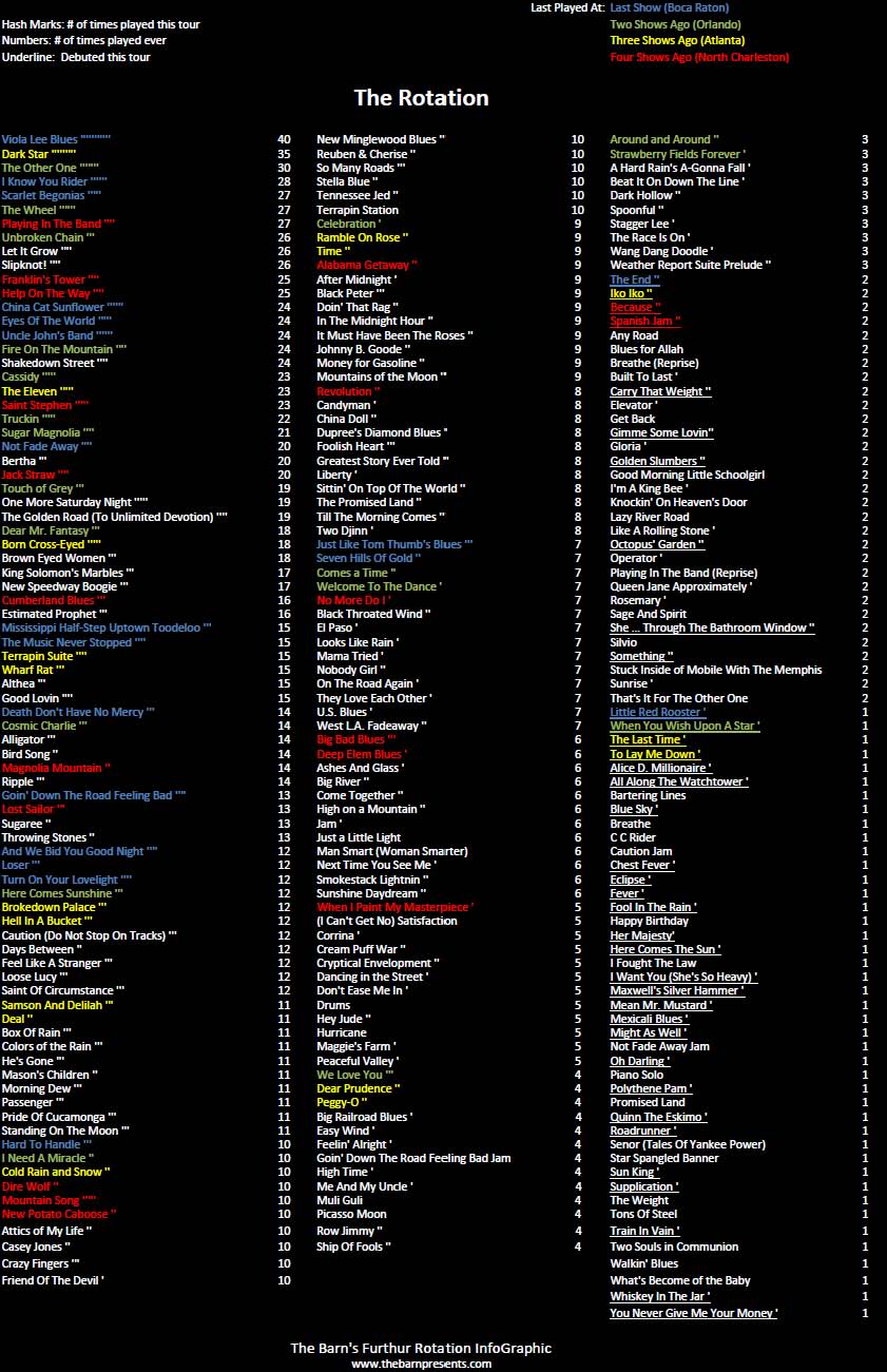
Came here looking for Summer Tour Info? Follow this link: http://tomorrowsverse.com/furthur Updated with data from the Boca Raton show.We're back! After taking the last couple of mini runs (NYE and Broomfield) off, we are here to deliver day-by-day rotation updates for Spring Tour.You may also notice some of the totals...
Mar 28, 2011
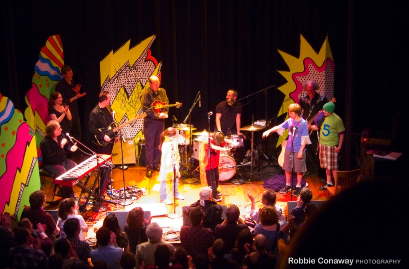
Robbie Fulks is just about the perfect person to artistically convey how the rational, but passionate music fan can put the career of Michael Jackson into perspective. Emotionally expressive, brutally honest, occasionally caustic, it is perfectly in character for Fulks to recognize and reinterpret the brilliance that underlies Jackson canon, while acknowledging that it is...

Mar 24, 2011
File this chart in the "funny because its true" folder. Sad to say that The Barn is part of the problem here rather than the solution -- we've still yet to find the volume slider for any of our streams or YouTube embeds that doesn't (a) default to ear splitting levels and (b) have an...
Mar 5, 2011
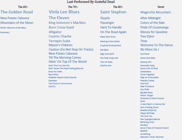
Updated 3/8 based on some discrepancies identified by the philzone.org communityThere's just something about Furthur. They've got so much Grateful Dead X-Factor yet still feel like their own band.I thought it'd be cool to start a series of InfoGraphics that compared the approaches of each of these bands that, using only setlist data and...

Feb 24, 2011
In the last week, we've shared streams of a Trey show and a Keller show at tomorrowsverse.com, and expect to share more in the future, but we're probably not even a 1000th of a pixel on this heat map which shows the relative size of the places we go online to listen to music...
Feb 21, 2011
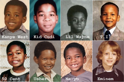
Okay, so hip hop is not our usual beat, but when I saw this over at the I Love Charts tumblog, I felt it was so incredible in so many ways that I just had to share.Who pissed in Lil Wayne's cheerios the morning of school pictures? My guess: Usher.
Feb 19, 2011
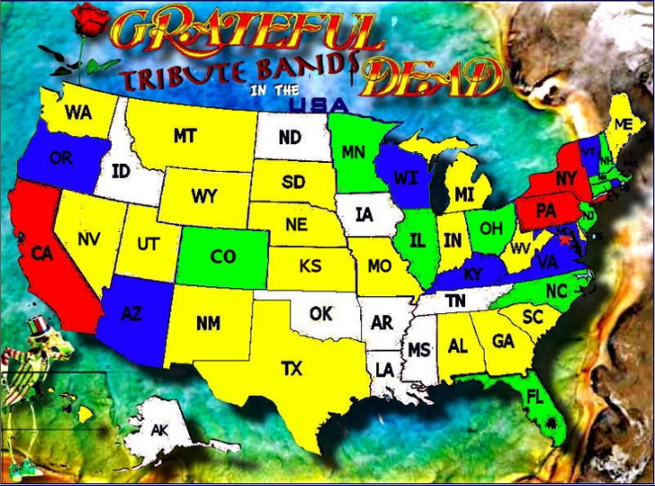
I recently stumbled upon a handy site, whose homepage falls right in line with The Barn's objectives of exploring the expanded world of The Grateful Dead and showcasing cool visual charts. The site is GratefulDeadTributeBands.com and their home page provides a nice US map color coded by the number of Dead bands they have...